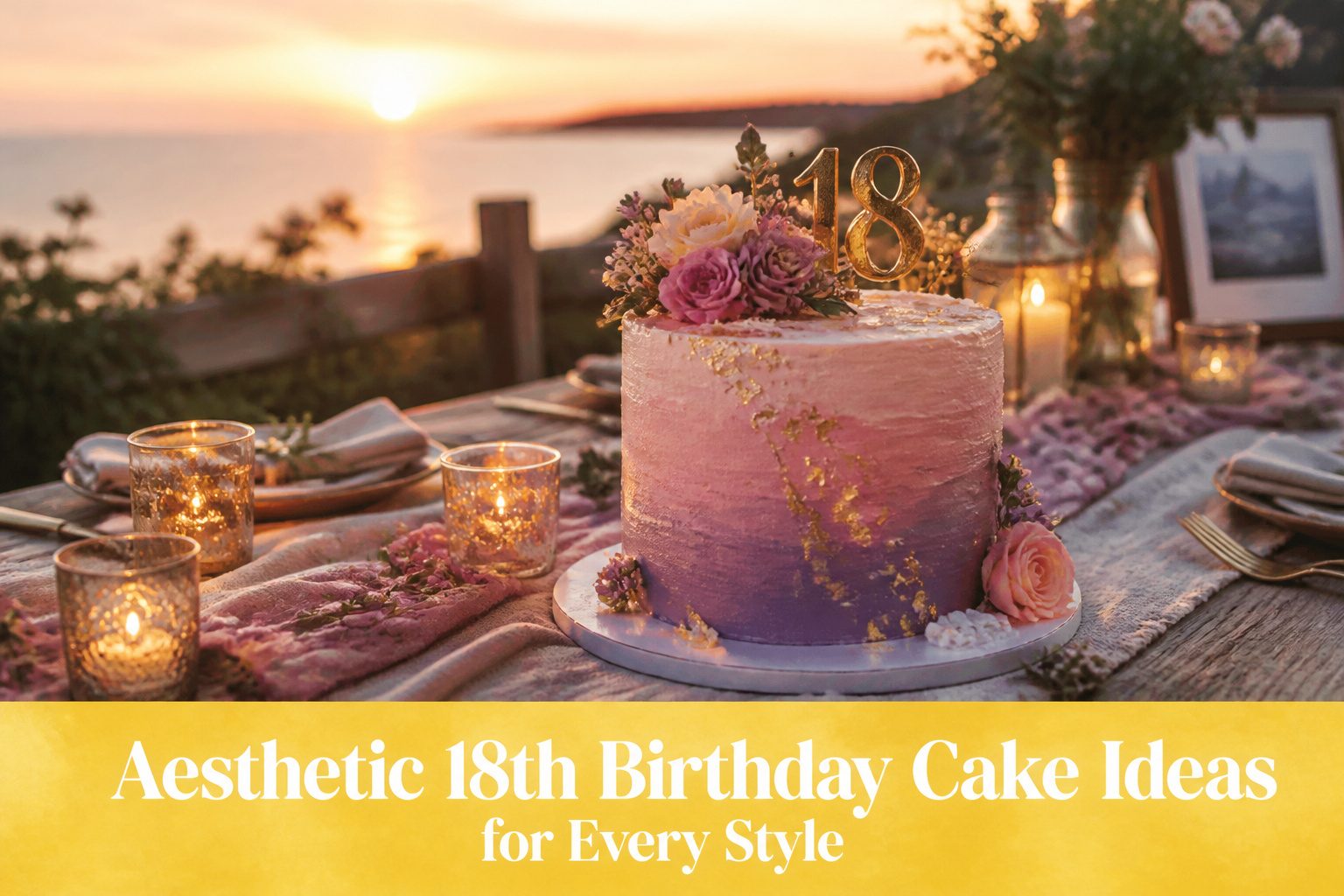
The right 18th birthday cake depends on whether your party runs past sunset, because a neon glow design built on tonic-water gelatin only fluoresces under blacklight and collapses into plain color in daylight.
Most of these twenty ideas stay practical for home bakers: gold leaf pressed onto chilled buttercream costs far less than it photographs, and a money-pull cake needs only a slit in the cardboard base and a ribbon to turn dessert into the night’s centerpiece.
One detail from the article that shapes the whole choice: black buttercream stains teeth temporarily, so the bold matte finish demands visible napkins or a warning to guests before the first slice.
1. Golden Glam Cake

A single tier of deep chocolate or espresso cake becomes the canvas for gold leaf pressed along the bottom edge or brushed metallic buttercream swept upward like a wave.
The finish reads far more expensive than it is because the eye goes straight to the shimmer and ignores the simplicity underneath.
Gold leaf looks fragile but handles more easily than fondant ribbons.
Buy it in transfer sheets, not loose flakes, and press it onto chilled buttercream with a dry fingertip. The buttercream needs to crust in the refrigerator for 20 minutes first or the leaf will dissolve on contact.
Metallic gold frosting is the more forgiving option.
Gel food coloring in champagne or pale gold, mixed with a drop of lemon extract to cut the metallic aftertaste, paints on with a wide soft brush in five minutes. The brushstrokes themselves become the texture; no smoothing required.
This is the cake to choose when the party dress is the statement and the dessert should nod without competing.
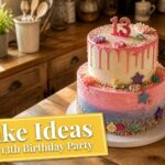
2. Pretty in Pink Ombre Cake

The ombre effect lives or dies on three clean stops of the same pink base, not three unrelated pinks fighting each other.
Deep rose at the base, medium pink through the middle, barely-there blush at the top: that gradient reads as intentional, not accidental.
Grocery-store gel coloring handles this fine. I start with a single batch of buttercream, divide it, and tint each portion from the same jar so the undertones stay related.
The method is straightforward. Crumb coat the whole cake in your palest shade, then apply the darkest rose to the bottom third with an offset spatula.
Blend the middle tone across the center, working upward with short strokes that overlap the edge where the colors meet.
Finish the top in blush. Stop before the colors fully mix; you want a band of transition, not mud.
This design shows up everywhere for a reason.
It photographs cleanly, works with standard round pans, and the only tool you need beyond a spatula is patience. Timing is the catch: buttercream crusts fast, so the blending has to happen in one session.
Rush it and the seam turns streaky. Give yourself the full twenty minutes of working time, though, and the result looks far more technical than it actually is.
3. The Drip Delight
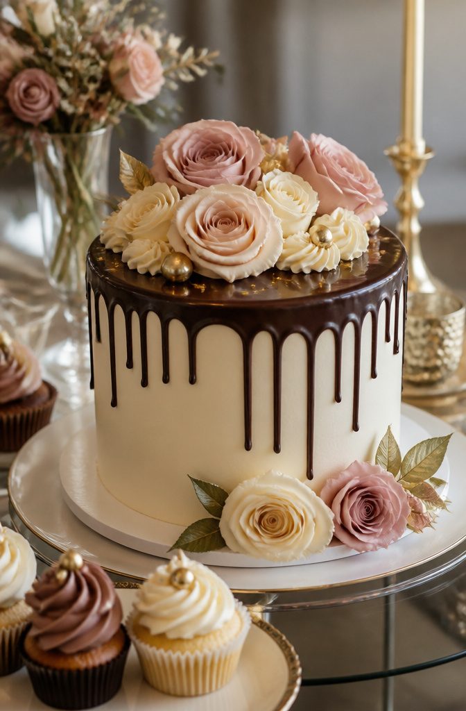
A ganache drip reads as intentional drama only when the drips stop where they should, neither sliding to the bottom inch nor halting in stiff beads.
The ganache needs to cool to roughly body temperature before it touches the cake, a point I check by holding the back of my hand to the bowl.
Too warm and it runs to the board; too cool and it pools on the top edge like thick paint.
The contrast is what makes the aesthetic work. A dark chocolate drip against ivory buttercream gives the cleanest read from across the room, though I’ve seen pale pink ganache over deep navy fondant land just as sharply.
The base color only matters in that it needs to be smooth. Any texture underneath catches the drip and breaks the line.
Temperature is the control you actually have. I rewarm the ganache in five-second bursts if it stiffens while I work, and I always test one drip on the back of the cake before committing to the front.
The ones that catch and hold mid-wall are the temperature you want for the whole pass.
4. Black & Gold Boss Babe Cake

Matte black buttercream reads as intentional, not accidental, when you keep the finish flat and velvety rather than glossy.
The metallic gold that goes on top needs to be edible luster dust mixed with lemon extract or clear alcohol; painted straight, it turns streaky and cheap-looking.
I would skip the fondant cutouts that some versions pile on and instead run a single clean band of gold around the base tier and add a few abstract brushstrokes higher up.
The flat black surface is what makes this feel like an adult celebration rather than a dressed-up sweet sixteen, since it borrows from the mood of a formal evening instead of party-store sparkle.
Black buttercream stains teeth and tongues temporarily, so you may want to warn guests or keep napkins visible.
For a two-tier cake, you’ll need more gel color than you expect to get the depth right without tasting bitterness, and the butter should be truly room temperature or the color stays streaked.
5. The Butterfly Fantasy Cake

Wafer-paper butterflies pinned in staggered arcs across fondant tiers give this design its signature lift, as though a flight just paused mid-air.
The effect reads handmade and airy even when the butterflies come straight from a craft-store packet. Icing versions take longer but hold up to humidity better in summer kitchens; wafer paper turns limp if the room runs warm.
Plastic or paper craft butterflies work just as well as piped ones, and the money you save buys better cake inside.
Three of the four reference designs I compared used this exact approach, which tells me decorators at every skill level keep landing here for a reason.
Movement versus authenticity: craft butterflies look flatter from the side, while curved icing wings catch real shadow. For a one-night party where most guests see the cake straight on, that difference rarely registers.
6. Minimalist Chic Cake

A single-color cake with a single perfect line or sphere reads as effortless, but cold-smoothed buttercream with a warm spatula finish is what makes it possible.
Every ripple and finger mark shows on bare color, so the surface has to be flawless before you add that one architectural detail.
I chill the cake until the buttercream hardens like clay, then smooth with a hot spatula in quick passes.
The cold firms the buttercream so you can scrape it glass-smooth; the warmth melts the outer micron and seals the pores. Work fast, because a lukewarm spatula drags instead of glides.
The sphere or line should be the only gesture.
Add a second detail and the eye loses the point. I think a pale pistachio or warm ivory works better here than stark white, which photographs as glare and reads as unfinished in dim party light.
This cake takes longer than one loaded with sprinkles and drips, because there is no ornament to distract from a dent in the side.
7. Money Cake
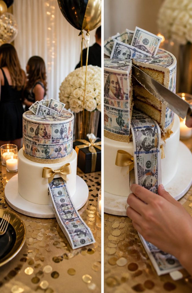
A money-pull feature turns a standard layer cake into the centerpiece of the moment: a hidden roll of bills threads through a slit in the cardboard base, and when the birthday celebrant tugs the ribbon, cash streams out in a continuous strip.
Edible printed bills across the fondant or buttercream finish the theme on the outside.
This one lands harder at eighteen than at any other age.
The guest of honor is newly legal to earn, spend, and manage their own accounts, so the cash inside reads less like a gift and more like a rite of passage.
Two ways to play it: fill the pull with ones for volume and spectacle, or tuck in larger denominations and keep the roll shorter.
The shorter roll wins for suspense, since a long strip of singles can drag on past the point of surprise.
Edible gold coins scattered around the base add polish without extra cost, and a simple name topper keeps the focus on the reveal.
Cleanup is easy if you line the money’s path with parchment inside the cake board; otherwise buttercream gums up the first bill and the pull stutters.
8. Neon Glow Party Cake

A neon glow party cake only works after dark, which makes it a natural fit for an 18th birthday that runs late.
The effect depends on pairing tonic water in clear gelatin or icing with blacklight fixtures around the cake table; the quinine fluoresces that cold electric blue, and gel food coloring in neon pink or green pops against it.
I would not attempt this for a daytime party.
The UV bulbs are cheap and widely available, but you need enough of them placed low so the cake actually catches the light rather than sitting in a dark spot between fixtures.
Splatter designs in neon edible paint read better than smooth fondant under blacklight because the texture catches the glow unevenly and looks alive.
Your guest of honor probably wants photos, and phone cameras struggle with UV-lit scenes unless someone brings a real camera and knows how to shoot them.
9. Travel Lover’s Cake
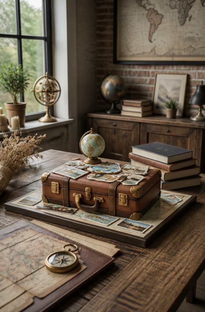
A suitcase, passport, or world-map design lands well for an 18-year-old planning a gap year or studying abroad.
The shape itself does most of the aesthetic work; a rectangular cake with fondant straps and corner guards reads as luggage without demanding carving skills I do not assume every home baker has.
Edible printed maps or fondant stamps are easier to execute than hand-painting. I have watched too many ambitious map attempts turn into smudged geography where Europe bleeds into Asia.
An edible image printed onto frosting sheets gives clean coastlines and labeled cities, and fondant stamps press fast into soft buttercream for a passport-page effect that looks deliberate even at midnight the day before the party.
A "Next Stop: Adulthood" topper adds the birthday context without requiring the whole cake to shout 18. The topper comes off before slicing, which matters when the travel theme needs to last exactly one evening and then become dessert.
10. Luxury Brand Cake

A cake done up in the exact colors and pattern of a luxury house’s shopping bag hits differently at eighteen than it does at thirty.
The matte black fondant with a hand-painted serif monogram reads as aspiration rather than excess because the birthday itself is the milestone, not the wardrobe.
I would keep the tiers clean and rectangular so the silhouette matches the box, not the handbag. Ribbon-width strips of fondant in the brand’s accent color, placed with a ruler, do more for the photo than any piped border could.
The risk is looking too theme-party, so I would skip logos that are recognizable at ten feet and opt for the house’s less famous packaging colors instead.
Buttercream underneath the fondant keeps the cake edible for guests who have spent enough on dresses to notice the difference between Chanel-beige and true beige.
11. Monochrome Marble Cake

Gray and white swirled fondant or buttercream reads modern and gender-neutral in a way few other finishes manage.
The marble effect comes from two colors barely mixed, not blended smooth. You want streaks and veins that look like actual stone, not a solid gray.
I prefer this in buttercream for home bakers.
Fondant gives sharper edges, but buttercream forgives a wobbly hand and tastes better after sitting out during the party. To get the streak right, tint about a third of your base batch in charcoal gray gel.
Drop spoonfuls of each color around the cake, then smooth once with an offset spatula. Overworking is the mistake that turns marble into mud; two or three passes across the surface is usually enough.
The monochrome palette pairs cleanly with a single metallic accent, like a thin silver band at the base or a simple cake topper.
It also photographs well under birthday candles or string lights, which matters more than most people admit when they’re picking a cake at 10 PM.
12. Bumblebee-Themed Cake
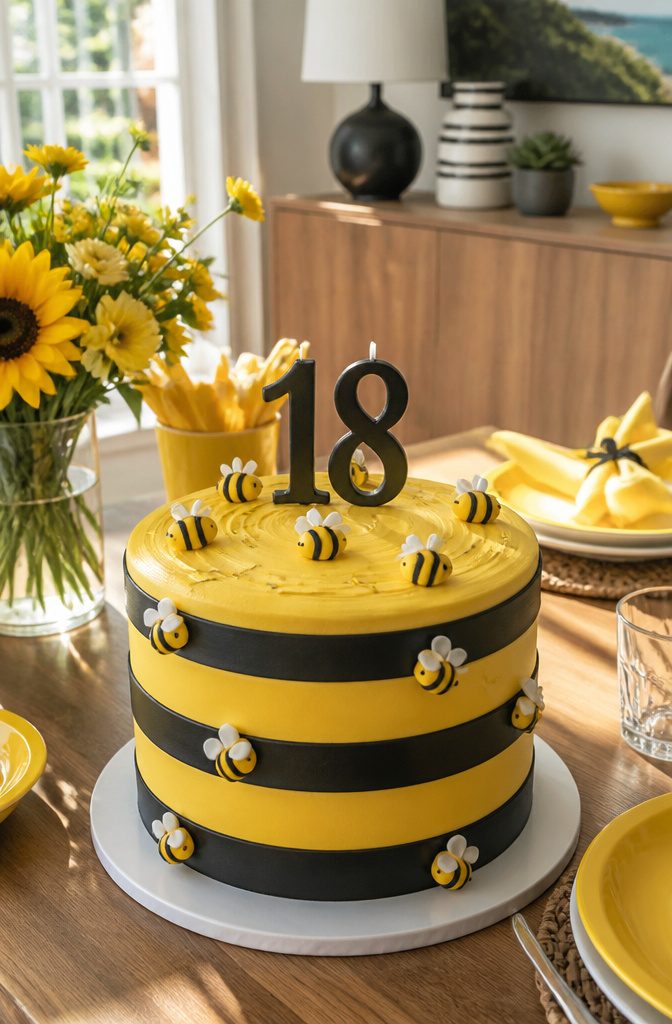
Yellow and black stripes read instantly from across a room, and a bumblebee cake carries that bold contrast without drifting into the soft pinks that still dominate most 18th birthday tables.
I like it as a choice for someone who wants the day to feel celebratory rather than romantic: the mood is cheerful and a little unexpected, and it sidesteps the "girl cake" default without landing in full neutral territory.
Small fondant bees take this from graphic to story.
You can press them out with a simple plunger cutter and dot on the stripes with a food-safe marker, or skip the fondant work entirely and use candy bees from the grocery aisle.
The store-bought ones hold up better in summer heat if the party runs outdoors, which matters more than most people plan for.
The stripe itself is the part that takes patience. I have watched more than one baker rush the alternating bands and end up with wobbles that cheapen the whole effect.
Chill the frosted cake between colors, give the buttercream time to harden, and the second layer goes on clean. What you get is a cake that photographs sharp and reads happy without shouting.
13. Cherry Red Vintage Cake

Deep red buttercream reads as nostalgic before it reads as bold, which is exactly why this style works for the 18th birthday that wants to feel like a celebration rather than a statement.
I would pipe a shell border along the base and top edge in the same cherry red, then add retro lettering in white buttercream or fondant cutouts: blocky serifs, slightly uneven spacing, the kind of script you would see on a 1950s diner menu.
A cluster of simple taper candles in white or cream, grouped off-center rather than in a rigid line, completes the look without turning precious.
The color is the risk here. A true cherry red takes more gel than you expect, and cheap coloring goes pink or orange before it goes deep.
Start with a buttercream base that is already tinted slightly yellow, which pushes the final shade toward true red rather than magenta.
This is the cake for someone whose Pinterest board runs to vinyl booths and milkshake glasses, not matte ceramics and single stems.
14. Romantic Pink Drips Cake

A soft pink base with matching or white chocolate drips reads intentional rather than fussy, and that restraint is what separates this look from a pink ombre cake.
Where ombre asks for gradient blending and three or four tones, the drip cake commits to one single shade and lets the drips do the visual work.
Fresh flowers are the detail that pushes this into 18th-birthday territory.
A small bottle of bubble on top adds the celebratory nod to adulthood, though you will want to check your local drinking age before you include it. The overall effect mixes luxury with femininity without tipping into overly sweet territory.
White chocolate drips set slightly softer than dark, which means they pool more dramatically at the base and catch light differently.
If you are choosing between pink and white, the white reads cleaner against a saturated pink buttercream, while matching pink drips give a more tonal, watercolor effect. Either way, the single-color base keeps the decoration feeling unified rather than busy.
15. Golden Palm Cake

A clean white or blush buttercream base reads as instant California sun, and real pressed palm leaves dried and sprayed with edible gold save you from hand-painting fondant if your timeline is tight.
The leaves arch across the tiers like a breeze caught mid-movement, catching light differently from every angle.
I prefer matte white as the canvas here; blush can shift toward nursery-sweet in certain light, and this design is about grown-up ease.
The gold reads richer against stark white, and the contrast photographs cleanly for an 18th birthday where the cake will end up in dozens of stories.
If you do work in fondant, roll the palm shapes thin enough to dry slightly before attaching, or the weight drags the silhouette downward by hour two of the party.
Edible gold paint mixed with a drop of lemon extract brushes on more evenly than spray alone, though spray is faster for the real leaves.
The shortcut is genuinely practical here, not a compromise, because pressed leaves carry natural veining no mold replicates.
16. Silver and Black Pearl Cake

Silver dragees look sharp against black fondant, but silver dragees are technically for decoration only in several states, and grocery stores that carry them usually stock them in the baking aisle with that exact warning on the jar.
The workaround I prefer is white chocolate pearls brushed with edible silver lustre dust. They read the same from across the room, and you can make them with a supermarket bag of white chocolate chips and a $5 brush.
Deep charcoal buttercream works here too, and it saves the step of smoothing fondant. I would go darker than you think; under party lights, a medium gray reads as brown.
For the spheres, roll the white chocolate into roughly gumball-sized rounds while the coating is still tacky, then dust after they set. One container of pearl dust covers more spheres than you will need for a single tier.
17. Blue Tilted Tier Cake

A topsy-turvy cake reads as playful chaos, but the tilt is an optical illusion built on absolute precision.
Internal supports, not gravity-defying luck, hold each tier at its angle. Dowels and cake boards cut to graduated lengths create the lean, and you plan this structure from the first tier, not the third.
Blue works especially well here because the color carries the Mad Hatter energy without extra ornament competing for attention. A smooth ombré from navy to sky, or even a single saturated cobalt, lets the architecture be the decoration.
The supports must be set before the fondant or buttercream goes on, since carving after the fact risks hitting your infrastructure and watching the whole illusion collapse.
This is not a last-minute project. You are building a small scaffold inside cake, and each angled tier needs time to settle before the next goes up.
For an aesthetic 18th birthday cake that photographs like sculpture, expect a full day of construction and a cake that serves fewer people than its height suggests.
18. Personalized Photo Cake

Edible printing has become ordinary enough that most grocery-store bakeries can run a photograph directly onto an icing sheet for you.
The image sits on top of the cake like a second skin, either covering the whole surface in one rectangular portrait or cut into tiles and arranged collage-style around the sides.
I would call this the safest way to make a cake feel specific to the person without learning any new technique yourself.
High-contrast photographs print far clearer than pale or washed-out ones. Bright backgrounds and saturated colors translate to icing better than soft pastels, which tend to muddy slightly in the edible ink.
A black-and-white portrait almost always looks sharper than a color photo taken in flat light, so if you are choosing between shots, favor the one with stronger tonal separation.
The icing sheet itself tastes like very thin, slightly sweet fondant. Some guests peel it off and eat the buttercream underneath; others eat it as part of the slice.
Either way, it does its job for the moment the candles come out and the phone cameras rise, which is usually what an aesthetic 18th birthday cake is asked to do.
19. Heart-Shaped Cherry Cake

A heart-shaped cherry cake works best for February birthdays or anyone with a name that matches the fruit, which is a narrower niche than it sounds until you realize how many Charlottes, Cheries, and even Jerrys fit the bill.
The shape gives you two options: a dedicated tin from the baking aisle or carving a standard round cake into the silhouette with a serrated knife, which I find easier for keeping the layers even.
Cherry flavor comes from jarred Morello cherries in the batter, not extract, which tastes medicinal in the quantity a heart this size needs.
Fresh cherries on top look beautiful for about two hours before they dull and weep; candied ones hold their gloss through the whole party and give you that deep, almost black-red against buttercream that photographs well.
If your birthday falls in February, this cake does the holiday’s work for it without leaning so hard on hearts that it feels like a supermarket special.
For a non-February date, skip the candied hearts and arrange the cherries in clusters so the shape reads as botanical rather than seasonal.
20. Black and Gold Bold Cake

The same black and gold pairing that reads soft glam in one cake turns architectural here with geometric stripes, sharp angles, or a repeating chevron pattern.
The palette still signals celebration, but the effect is deliberate and modern rather than ornate.
What makes this style achievable at home is a freezer-paper stencil or a strip of acetate held flush against the buttercream.
Masking with either material gives you a clean edge without rolling fondant or wrestling with a bench scraper for perfect freehand lines.
I prefer acetate for repeating vertical stripes because you can see through it to align the next section; freezer paper works better for a single bold shape, like a diagonal band across one tier.
Buttercream needs to crust slightly before you mask, or the stencil will smudge. In warm kitchens that takes longer than you expect, so budget the time or chill the cake for 20 minutes between colors.
The trade-off against the softer Boss Babe style is that any wobble in your base coat shows, so the first layer of buttercream has to be smooth even though you are covering most of it.
Frequently Asked Questions
What are some unique 18th birthday cake ideas?
Aesthetic 18th birthday cake options include a Golden Glam cake with metallic buttercream or gold leaf, a Black & Gold Boss Babe cake with matte black and architectural gold details, a Neon Glow Party cake that fluoresces under blacklight, a Money Cake with a hidden cash pull feature, and a Blue Tilted Tier cake built on angled internal supports.
How can I personalize my 18th birthday cake?
Personalize through edible photo prints using high-contrast images for sharper results, a travel-themed design with the guest of honor’s destination plans, a luxury brand cake in their aspirational house colors, or a heart-shaped cherry cake tied to their name or birth month.
What flavors are popular for 18th birthday cakes?
Specific flavor pairings matter less than the visual finish for aesthetic cakes, since the decoration drives the style.
What color symbolizes an 18th birthday?
Deep cherry red, monochrome gray, and saturated cobalt also appear as mature alternatives to typical pastel birthday colors.
Which cake is trending now for birthday?
The monochrome marble effect in gray and white also reads as current and gender-neutral.